Most people decide whether to watch a video in the time it takes to scroll past it. On a phone, your thumbnail is about the size of a postage stamp, sitting next to a dozen others that are all trying to get the same tap. Any text on it has roughly a second to be read and understood.
That's why the best thumbnail text is short, big and adds something the title doesn't. This guide covers what to write, how to make it readable, and how to use our free Thumbnail Text Generator to try ideas before you open your design app.
Do you need text at all?
Not always. A strong image with a clear subject, like a face reacting or a dramatic before and after, can work on its own. Text earns its place when it adds context the picture can't give: a result, a question, a number or a twist.
Ask yourself what a viewer would wonder when they see the image. If the answer is "what happened?" or "did it work?", a few words can turn that question into a reason to click.
Keep it to five words or fewer
If someone can't read your text in about a second at a small size, it's too long. In practice that means two to five words, and often just two or three. Every idea from the Thumbnail Text Generator is five words or fewer for that reason.
A good test: shrink your finished thumbnail down to the width of your thumb on your phone screen. If you have to squint, cut words or make them bigger.
Five kinds of thumbnail text that work
The generator groups ideas into styles. Each one plays on a different reason people click.
- Shock. "DON'T DO THIS!" or "BIG MISTAKE". Signals a warning or a surprise. Use it when something genuinely went wrong or right in the video.
- Curiosity. "THE SECRET" or "WAIT FOR IT…". Opens a question that only watching will close.
- Result. "IT WORKED!", "30 DAYS LATER" or "BEFORE → AFTER". Promises a payoff, ideal for challenges, makeovers and experiments.
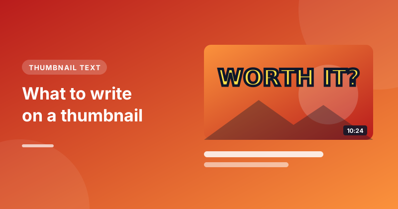
- Question. "WORTH IT?" or "REAL OR FAKE?". Invites the viewer to form an opinion, then check it.
- List and how-to. "3 SIMPLE STEPS" or "BEGINNER BAKING". Tells learners this is a quick, practical video.
In the Thumbnail Text Generator, type your topic in a word or two, pick a style or leave it on All styles, and press Generate text. Each idea appears on a mock thumbnail so you can see how it reads before you commit.
Don't repeat your title
The title and thumbnail are seen together, so repeating the same words wastes space. Let them split the work:
- Title: "I Tried Baking Bread Every Day for a Month" (searchable, descriptive)
- Thumbnail text: "DAY 1 vs DAY 30" (the hook)
The title tells people and search engines what the video is. The thumbnail gives them the emotion or the tease. If you're still working on the title, our guide on writing YouTube titles that get clicks pairs well with this one.
Make it readable at a tiny size
The words matter, but so does how they look.
- Use a thick, bold font. Impact, Bebas Neue, Anton and Montserrat Black are popular because their letters stay clear when small. Thin or decorative fonts turn into a blur.
- Add an outline or shadow. A dark outline around white or yellow text keeps it readable on any background.
- Pick a colour that contrasts. Yellow or white on a dark image, black on a bright one. Avoid colours that blend into the photo.
- Make it big. Text should fill a good part of the thumbnail's width. If it looks a bit too large on your monitor, it's probably right for a phone.
- Mind the corners. YouTube puts the video's length in the bottom-right corner, so keep important words away from there.
YouTube thumbnails are 1280×720 pixels (16:9) and must be under 2 MB, as JPG, PNG or GIF. Design at that size and check it zoomed out.
Common mistakes
- Writing a sentence. "In this video I'm going to show you how I fixed it" belongs in the description, not on the thumbnail.
- Too many colours and fonts. One font and one or two colours look clean. More looks cluttered at small sizes.
- Text over faces. If your face is the hook, don't cover it. Put the text beside it.
- Promising what the video doesn't show. "IT EXPLODED" on a video where nothing explodes brings clicks and then quick exits.
Study what works in your niche
Look at the most-watched videos on topics like yours and notice what their thumbnails have in common. How many words do they use? Where do they put them? You can open any video's thumbnail at full size with our Thumbnail Viewer to look closely at fonts, outlines and layout. Use it for inspiration, not copying: thumbnails belong to their creators.
Test it
Once your video is live, check its impressions click-through rate in YouTube Studio after a few days. If it's low compared with your other videos, try different text. Eligible channels can use Test & Compare in YouTube Studio to upload up to three thumbnails and let YouTube show each to viewers to see which one performs best.
Short, bold, different from the title and true to the video: get those four right and your thumbnail text is doing its job.